- Properties are applied to the whole content of the element, while the changes done in options are only applied to your selection.You can edit the properties of the following elements:
Title You can add a custom title to your email template. You will get the following options when trying to update the title.
| Fonts and Size: Bold, Italics, Underline, Strikethrough |
|---|
| Text Alignment and Color |
| List options: Numbered and Bullets. |
| Insert link |
| Insert attributes |
| Meeting scheduler |
| Unsubscribe |
Content Properties for Title: The Content Properties widget will appear on the left when you select the Title element.
| Title | Select the size of the title heading. The default and the biggest is H1 > H2 > H3. |
|---|---|
| Font Family | Select the font style for the title. |
| Font Size | The default font size is 24, You can update the size by + or - buttons. |
| Text Color | Select text color from the color palate or type the color code. |
| Link Color | Select the link color from the color palate or type the color code. |
| Align | Choose from Left, Center, Right, or Justify. |
| Line Height | Line height is the space between two lines added in the Email title. |
| Letter Spacing | Set the spacing between two letters. |
| Padding | Set padding(Spacing) from all sides of the content or individual sides. |
| Hide On | Hide the title on the Desktop or Mobile devices. |
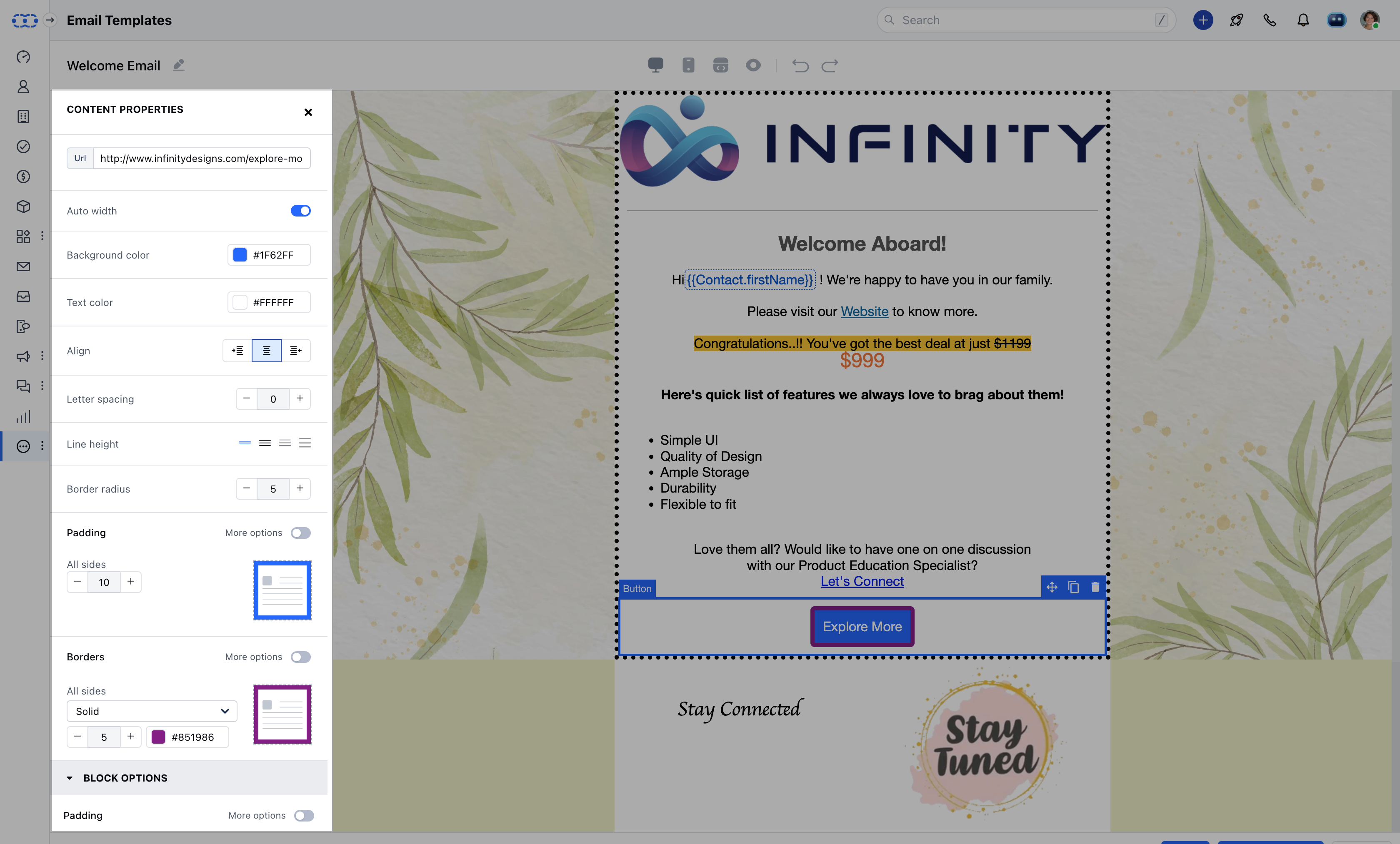
| ### Content Properties for Button | URL | Mention the URL that you want to open when the button is clicked. |
|---|---|---|
| Auto-Width | This will automatically set the width of the button according to the content area. | |
| Background Color | Select the Background color from the color palate or type the color code. | |
| Text Color | Select text color from the color palate or type the color code. | |
| Align | Choose from Left, Center, Right, or Justify. | |
| Letter Spacing | Set the spacing between two letters. | |
| Line Height | Line height is the space between two lines added in the Email title. | |
| Border Radius | Increase/Decrease the Border Radius for rounding off the edges of the button. | |
| Padding | Set padding(Spacing) from all sides of the content or individual sides. | |
| Borders | Select from the Solid, Dotted, or Dashed border for the button. | |
| Hide On | Hide Button for Desktop or Mobile app devices. |
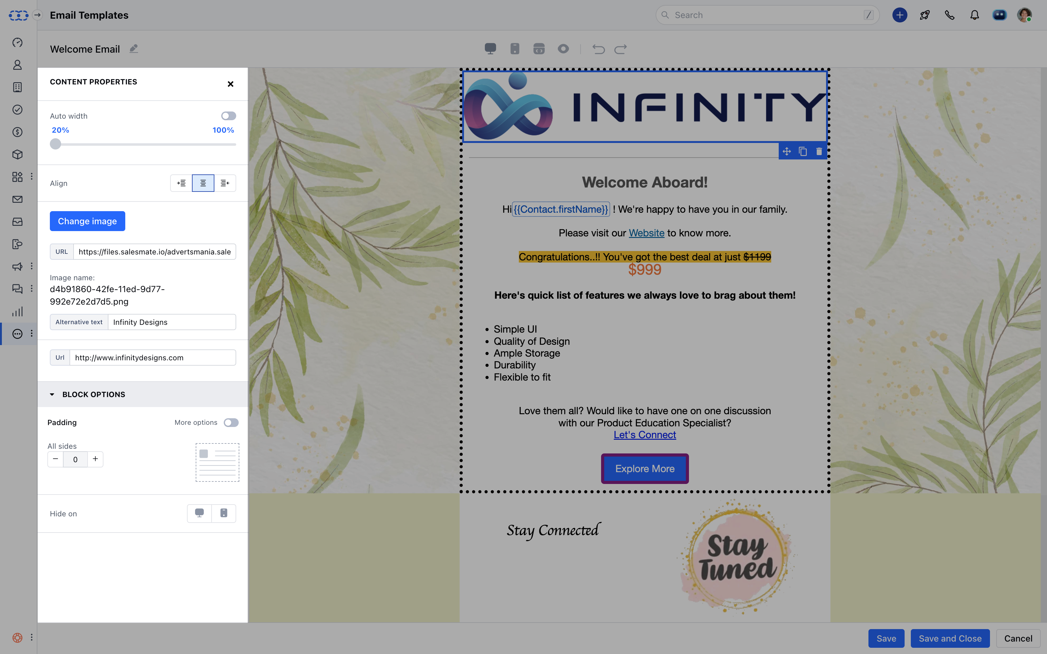
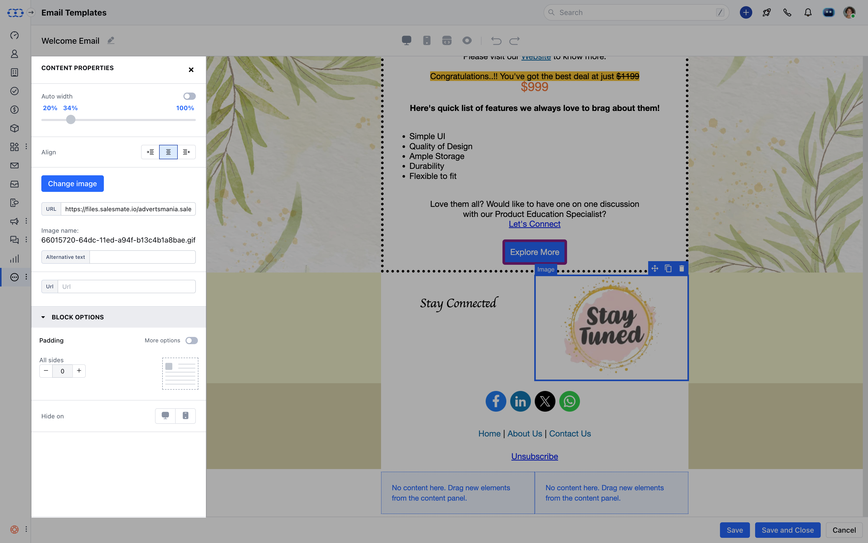
| ### Content Properties for Image | Auto-Width | This will automatically set the width of the image according to the content area. |
|---|---|---|
| Align | Choose from Left, Center, Right, or Justify. | |
| URL | Enter the complete URL of the page from where you want to fetch the image. | |
| Alternative Text | Add the alternative text to display if the image is not visible. | |
| Padding | Set padding(Spacing) from all sides of the content or individual sides. |
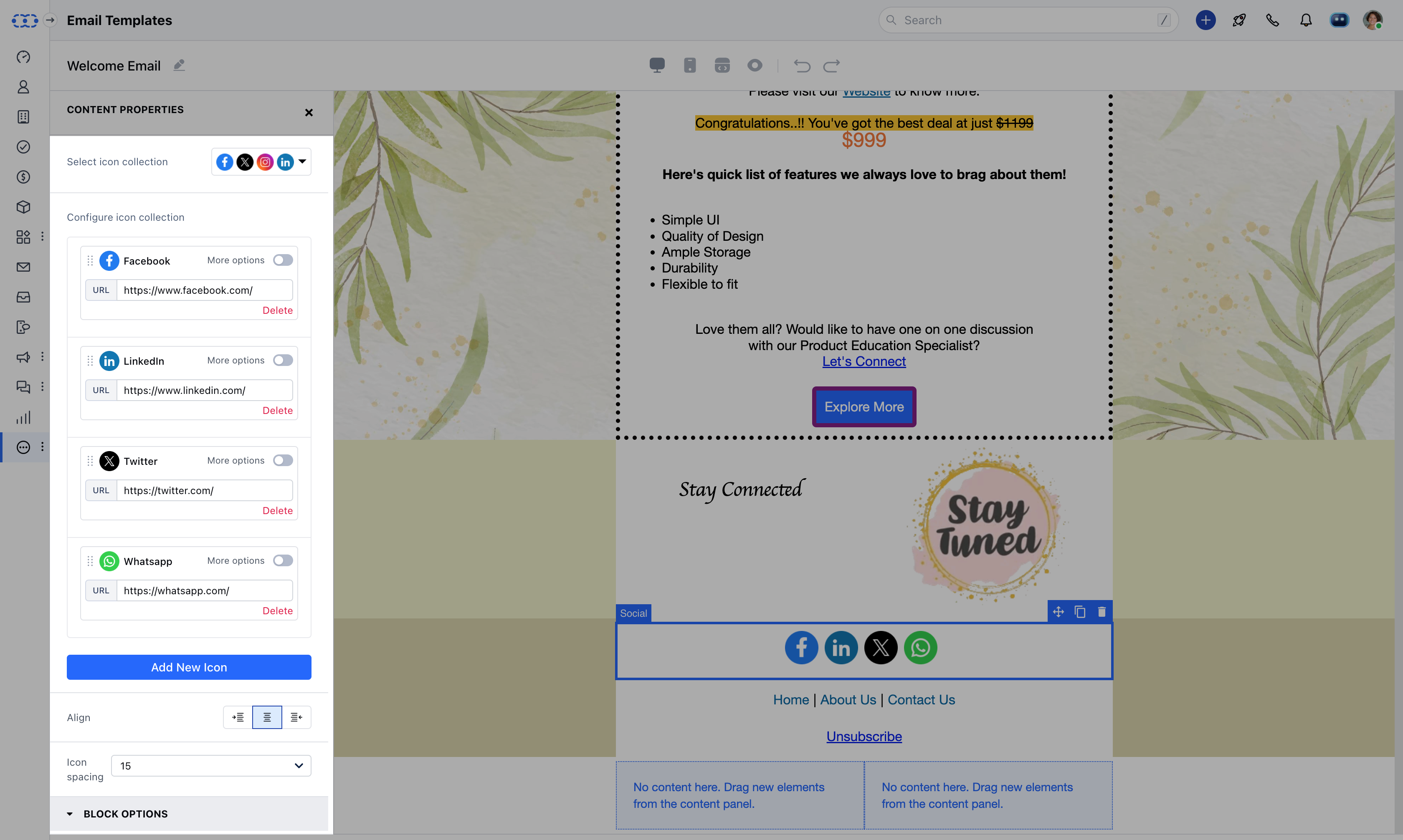
| ### Content Properties for Social Links | Select Icon Collection | Select from different styles of the default social icons i.e. Facebook, Twitter, LinkedIn, and Instagram. |
|---|---|---|
| Configure Icon Collection | You can update the URL, Image, and title for the icon. | |
| Add New Icon | You can choose from predefined icons (Pinterest, Snapchat, Telegram, YouTube, Spotify, or WhatsApp)or add a custom icon. | |
| Align | Choose from Left, Center, Right, or Justify. | |
| Icon Spacing | Increase/Decrease spacing between each icon. | |
| Padding | Set padding(Spacing) from all sides of the content or individual sides. | |
| Hide On | Hide Button for Desktop or Mobile app devices. |
**
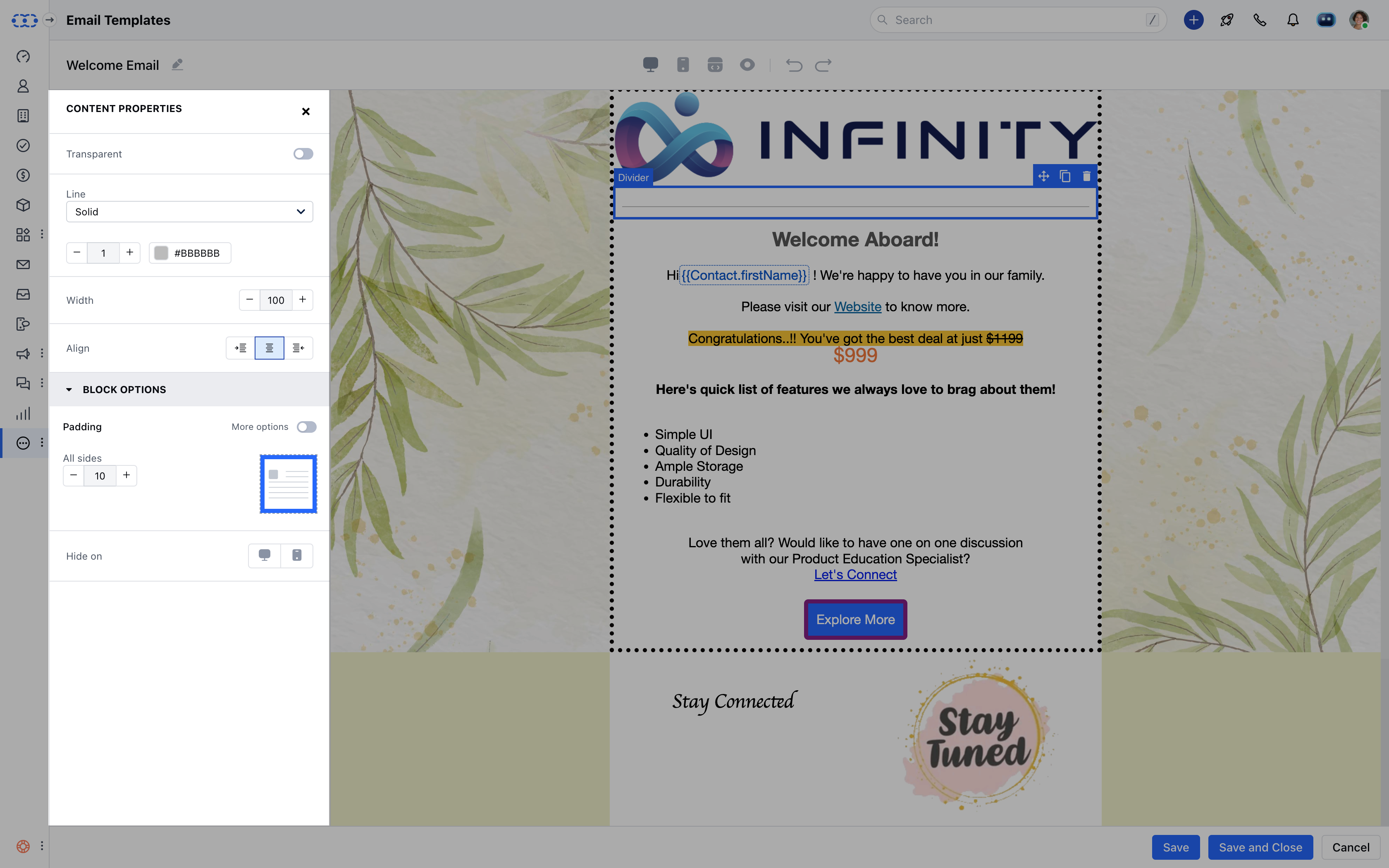
| **### ** Content Properties for Divider ** | Transparent | Enable this option to make the divider transparent. |
|---|---|---|
| Line | Choose from the type of line for a divider. i.e. Solid, Dotted, or Dashed. | |
| Width | Set the width of the line for a divider. | |
| Align | Choose from Left, Center, Right, or Justify. | |
| Padding | Set padding(Spacing) from all sides of the content or individual sides. | |
| Hide On | Hide Button for Desktop or Mobile app devices. |
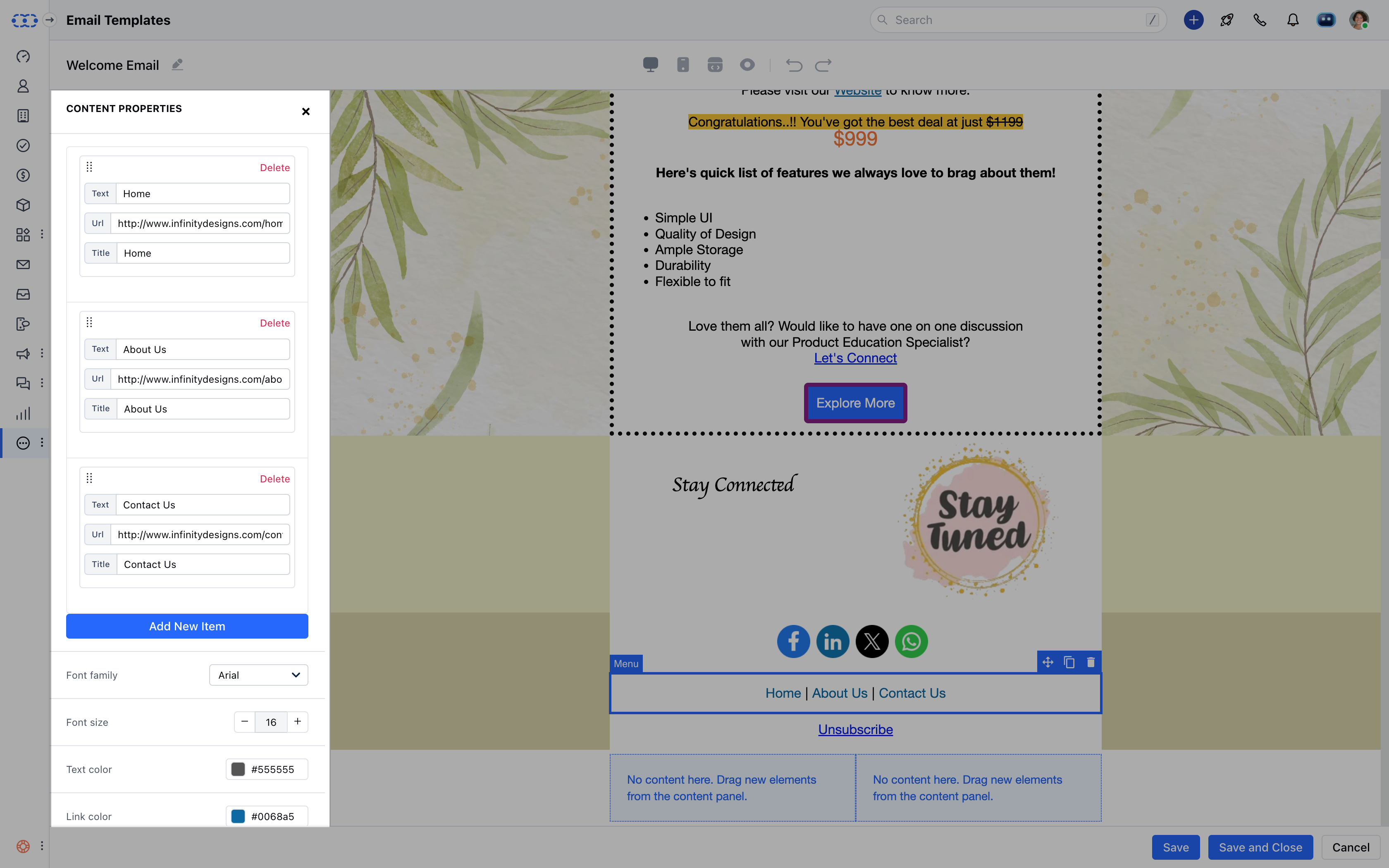
| ### Content Properties for Menu | Add New Item | Add the list of items for the Menu. |
|---|---|---|
| Font Family | Select the font style for the menu item. | |
| Font Size | The default font size is 14, You can update the size by + or - buttons. | |
| Text Color | Select text color from the color palate or type the color code. | |
| Link Color | Select the link color from the color palate or type the color code. | |
| Align | Choose from Left, Center, Right, or Justify. | |
| Letter Spacing | Increase/Decrease Spacing between letters of the menu item. | |
| Layout | Select a Horizontal or Vertical Layout for the menu. | |
| Separator | Add any text to separate menu items horizontally. | |
| Padding | Set padding(Spacing) from all sides of the content or individual sides. |