Topics covered:
Steps to Add Variables
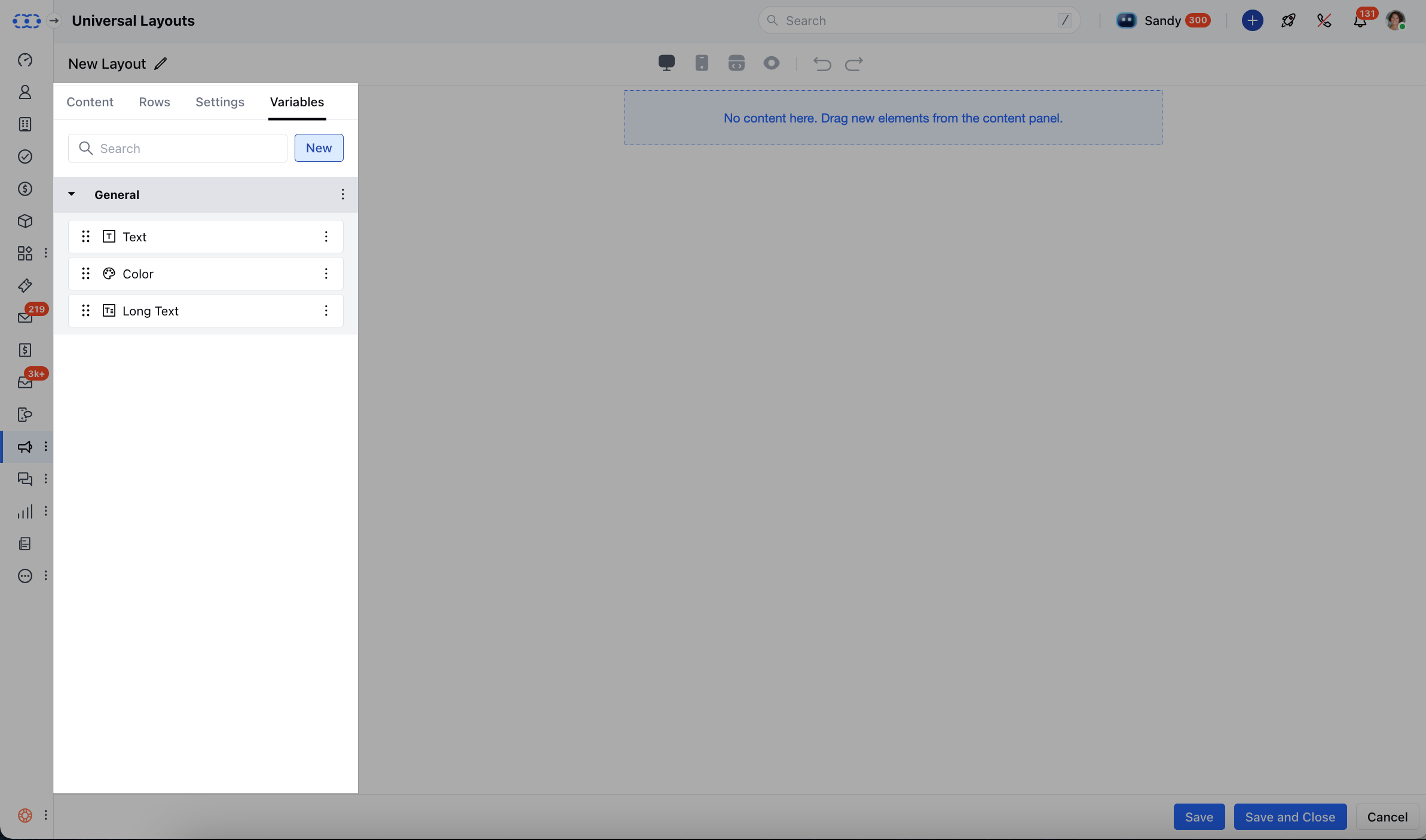
From the left menu, open the Template Library.
Configure Variable Types
Choose a variable type and set it up with these options: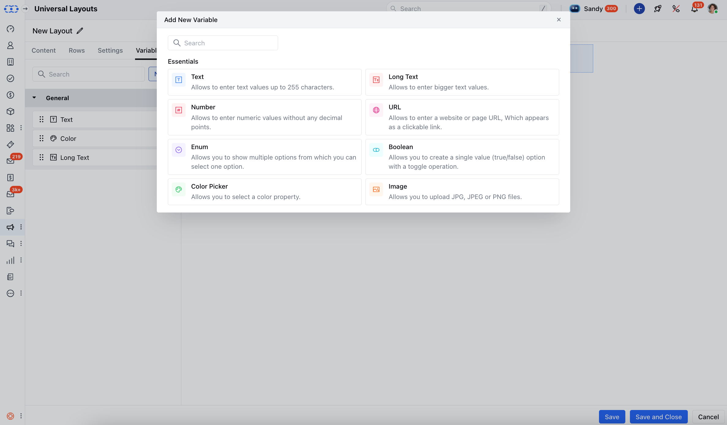
- Text:Name: What the variable is called in the editor (e.g., Welcome Message)Variable Name: Give it an Internal name. This is only used for internal reference (e.g., welcome_message)Section: Where this text will show up in your layout or block Default Value: The starting value (e.g., Hello!), which you can change later Validation: Add rules to restrict input Mark Required: Make this field required if needed Color Picker:Name: Label for the color (e.g., Button Color)Variable Name: Give it an Internal name. This is only used for internal reference (e.g., button_color)Section: Where this color will be used Default Value: Choose a default color Image:Name: This will be the name shown in the editor (e.g., Banner Image)Variable Name: Give it an Internal name. This is only used for internal reference (e.g., banner_image)Section: Where the image will be placed Default Value: A default image to display Default Embedded URL: Use a URL to embed the image Default ALT Text: Add a short description for accessibility Mark Required: Make the image required if needed URL:Name: The name label shown in the editor (e.g., Website Link)Variable Name: Give it an Internal name. This is only used for internal reference (e.g., website_link)Section: This is where the link appears Default Value: You can add a sample URL (e.g., https://example.com)Validation: Add input rules to allow only valid URLs Mark Required: Make it mandatory if needed Boolean:Name: Give it an appropriate name (e.g., Show Banner)Variable Name: Give it an Internal name. This is only used for internal reference (e.g., show_banner)Section: This is where the toggle applies Default Value: Choose whether it’s on or off by default Number:Name: Give it an appropriate name (e.g., Discount Percentage)Variable Name: Give it an Internal name. This is only used for internal reference (e.g., discount_percentage)Section: This is where the number is used Default Value: Give it a default value (e.g., 10)Validation: This will limit the inputs as per your needs (e.g., numbers only)Mark Required: Make the field required if necessary Enum:Name: Label in the editor (e.g., Button Style)Variable Name: Give it an Internal name. This is only used for internal reference (e.g., button_style)Section: Where the dropdown appears Options: Add at least two choices (e.g., Primary, Secondary)Default Value: Set one option as default Mark Required: Make a selection mandatory Text Area:Name: This is the Editor label (e.g., Footer Text)Variable Name: Give it an Internal name. This is only used for internal reference (e.g., footer_text)Section: This is where the text appears Default Value: Add sample or default content (e.g., Thank you for choosing us!)Validation: Add rules for input in the text area.
- Mark Required: Make the field mandatory if needed