Topics covered:
How to Configure the Card Component
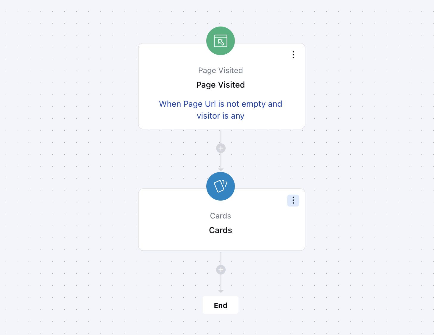
While setting up a Smart Flow, select the Card action from the list of available actions.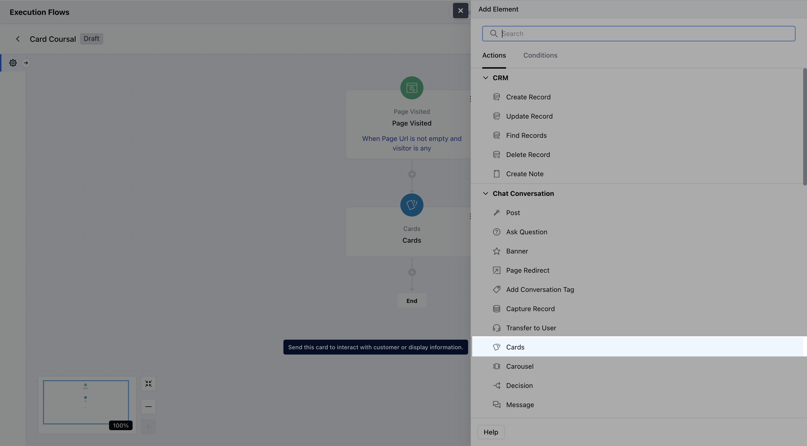
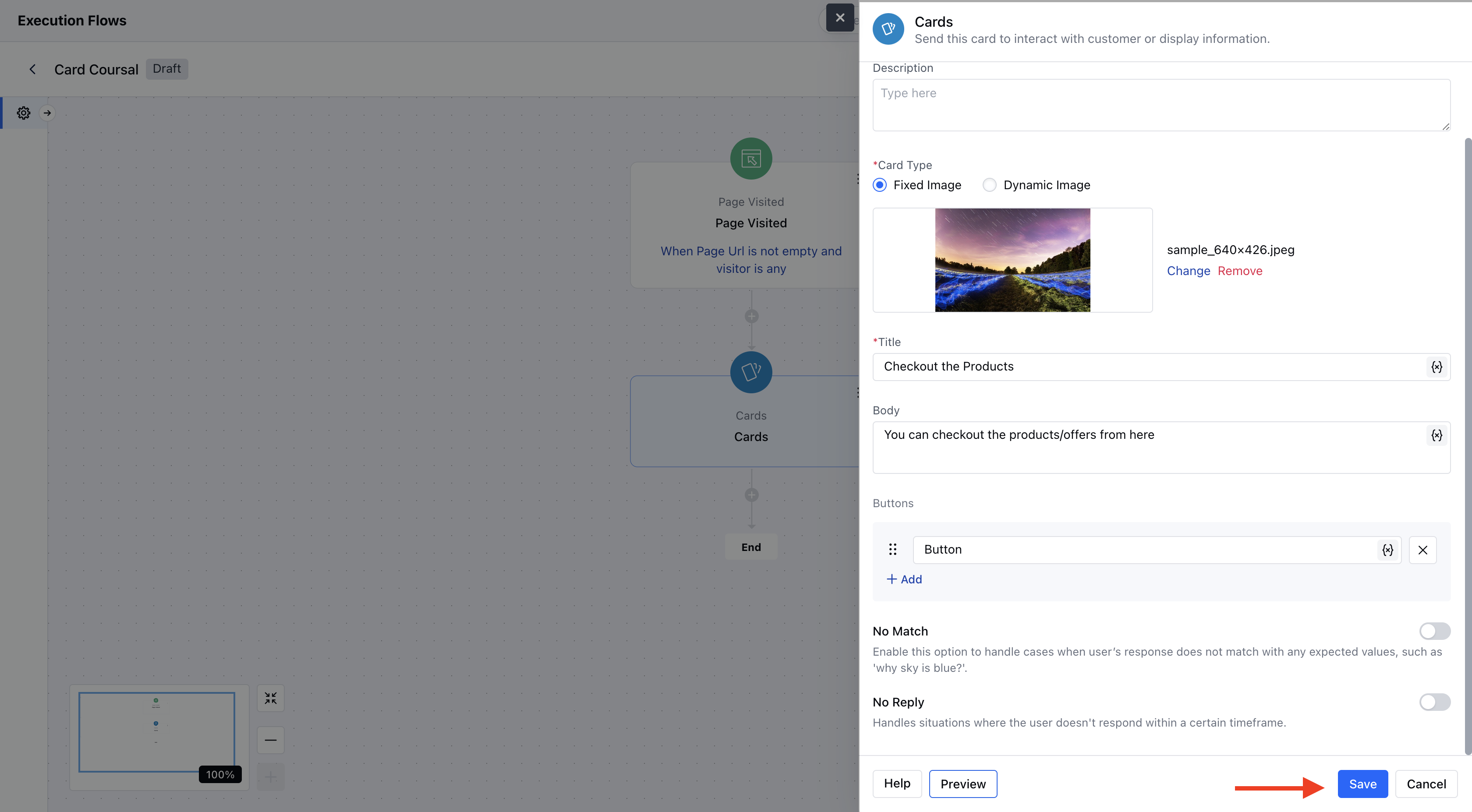
- Description: Optionally, enter an internal description to describe the purpose or use of this card in the flow.
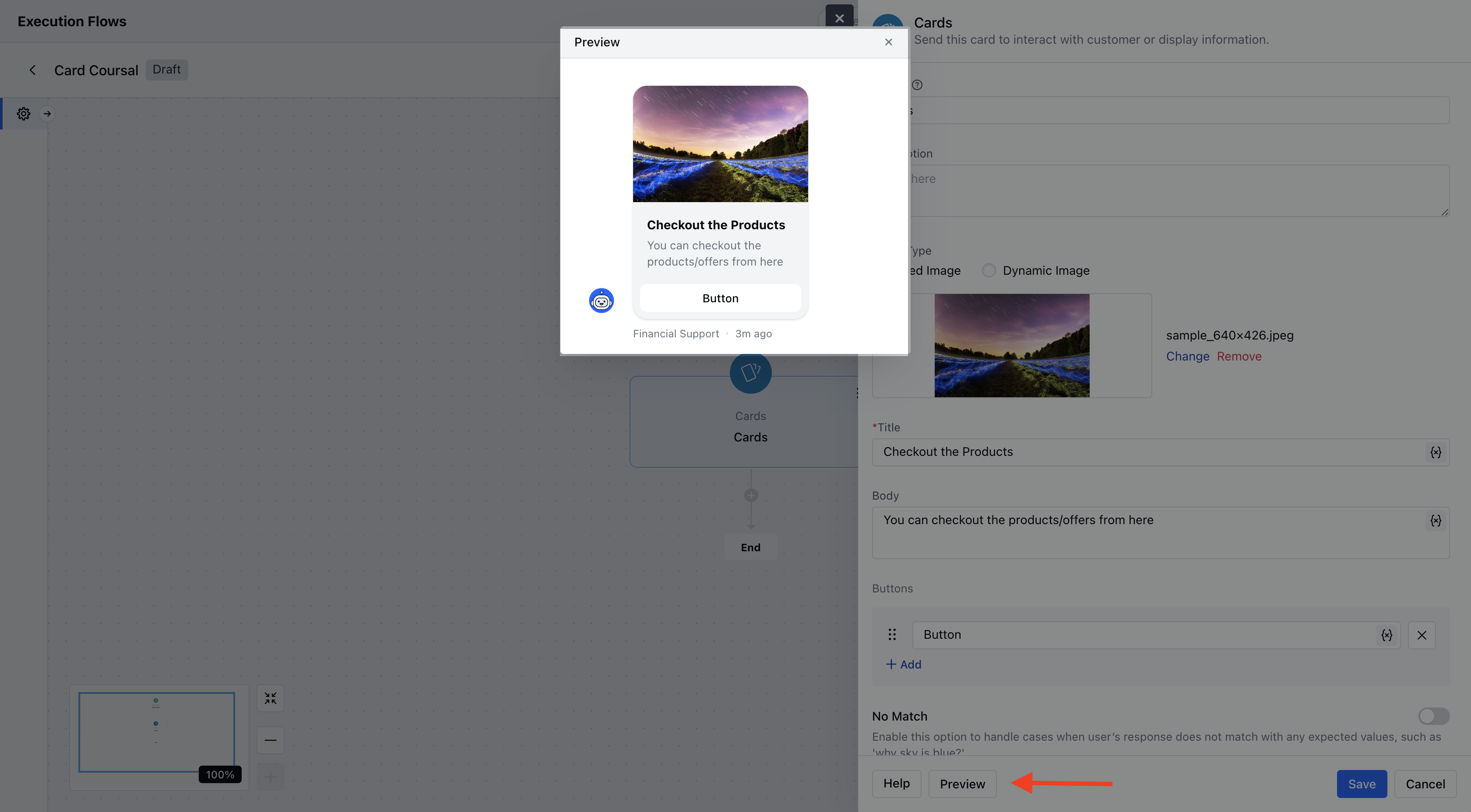
- Image: You may upload a static image or provide a dynamic image URL (supports variables).Supported formats: jpg, jpeg, png, gif.If no image is provided, a blank thumbnail will be shown.
- Title: This is the main heading on the card. This can contain text or variables (for dynamic content).
- Body: Descriptive text shown below the title. It can include dynamic variables and supports basic formatting (bold, italic, underline, etc.).
- Buttons: You can add up to 10 interactive buttons. Each button must have a label and can use variables.
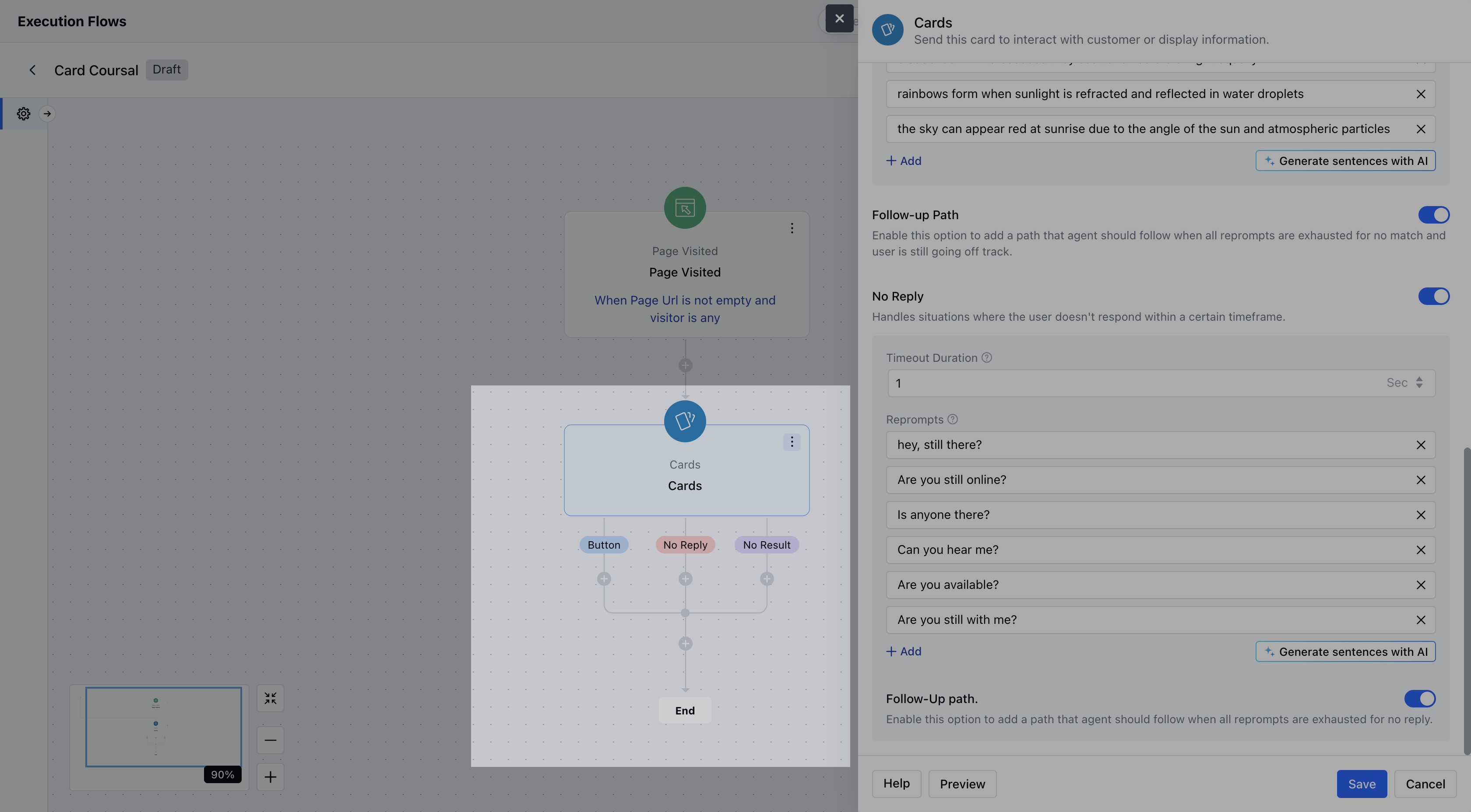
- No Match: You can enable this option to handle unexpected user responses.
- No Reply: You can enable this option to handle silence or lack of user interaction.
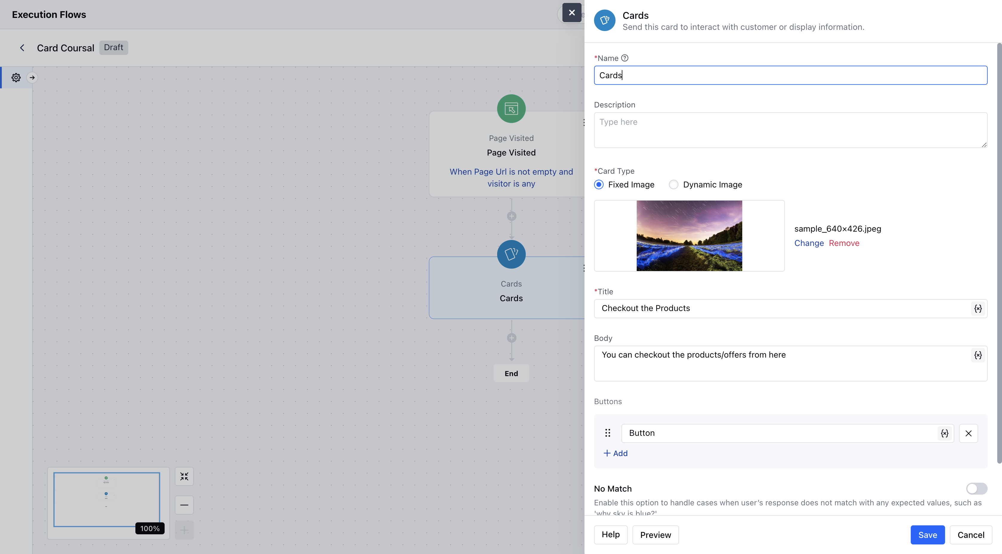
- After configuration, click Save to complete the setup.
Practical Example:
Let’s say a visitor lands on your website’s Product/Services page. You can use the Cards component to display a contextual pop-up message - promoting an offer, showcasing a featured product, or guiding them to a demo or contact form